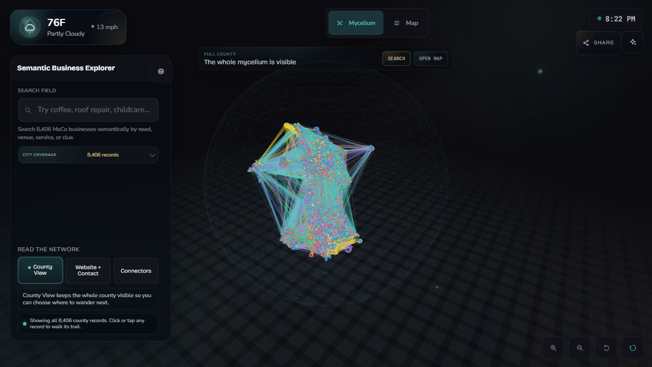
County view
A dense overview keeps the full record set visible while the interface explains what each mode changes.
Portfolio case study
A browser-based semantic explorer over 8,406 local business records. Search by need, focus one business, walk similar neighborhoods, and carry that record into a live map.
The review path
The live app is intentionally dense. This is the shortest path through the experience: county context, search, focus, semantic neighborhood, and map handoff.
All 8,406 records stay visible so the search result has a place in the larger network.
Typing “coffee” brings the most relevant businesses forward without reducing the demo to a flat table.
The selected business becomes an anchor, nearby businesses glow, and the lines show semantic connections.
The focused record carries into terrain mode, then returns to the network without losing context.
Working surfaces
The point is not a static chart. The explorer has separate states for full-network browsing, search focus, neighborhood walking, and map return.
A dense overview keeps the full record set visible while the interface explains what each mode changes.
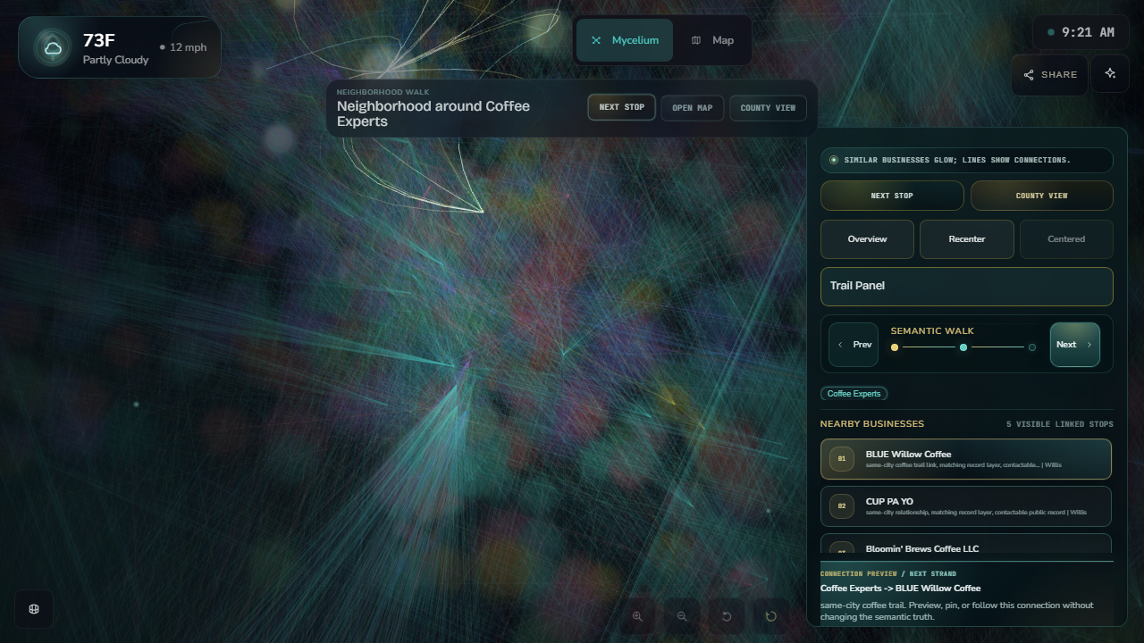
Focused neighborhoods make semantic relationships inspectable instead of leaving the graph as a decorative cluster.
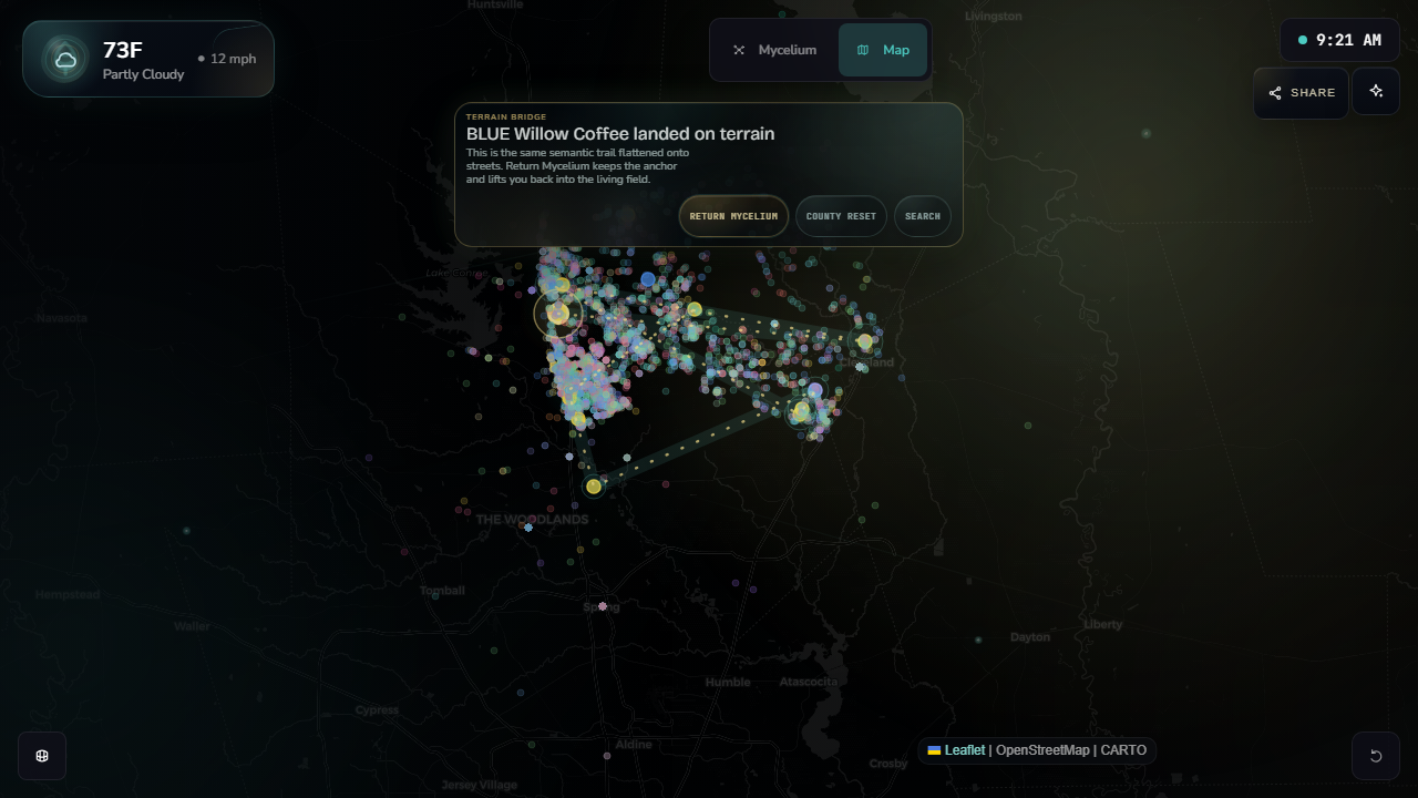
The selected business can land on terrain and return to the network, preserving the visitor’s place.
Technical scope
This is a portfolio artifact for dense data UX: semantic search, browser rendering, state choreography, mobile hardening, and live deployment discipline.
The core achievement is simple: public business records become a navigable network, and the interface keeps the visitor oriented while moving between search, graph, neighborhood, and map.
Stack: HTML, CSS, JavaScript, Three.js, Leaflet, public record data, and generated semantic thread artifacts.
Under the hood
The explorer is the public surface of a LeadOps workflow: local records are cleaned, public-safe fields are exported, semantic artifacts are generated, and the browser renders those artifacts as searchable neighborhoods.
The technical takeaway: this is not just a polished front end. It is a shipped interface over a structured data workflow with public/private boundaries, generated semantic context, and browser-level QA.
Proof path: LeadOps corpus → public-safe export → semantic search and thread artifacts → live WebGL explorer.
Start in County View, search for a familiar need like “coffee” or “roof repair,” then enter the neighborhood around any result.